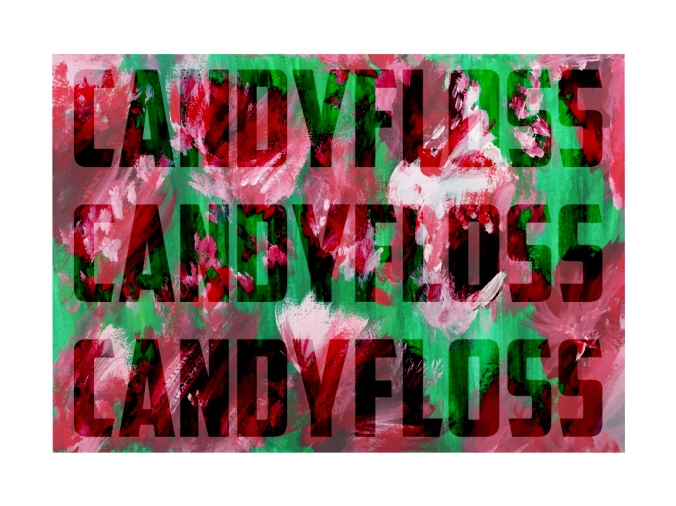
Colour & The Word
16/11/2018
Letter given: E
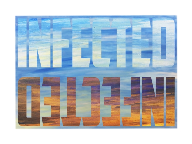
Word Chosen: Eerie
Personal colour and imagery associations: Dark; muddy; gloomy; vacant space; silence; contrasting; cold; melancholy; purples; omniscient; hellish; A Quiet Place; tension; blue, or navy; The VVitch; ghostly; shredded; singular entities; monstrous; nature; natural; demons; possessed; archaic; religion
This project began with the initial providing of a singular letter, individual to each person. We had to decide, with this letter, a single particular word which triggered a visual, emotional or response which could provide the image of colour. I was given E as my letter, before pondering over words and coming to the conclusion that Eerie was emotive enough for myself. Though I don’t explore it a lot, I enjoy the darker depictions in art; with perhaps sinister imagery or meanings. The term eerie was rather open with interpretation, though in literature I was often reminded of all the horror novels I had read; the tension between each word and the author’s craft in holding me by my throat every time I flicked through the pages. My immediate colour associations was of muted blues; frigidity and almost cold vacancy. My mind explored and then I imagined the contrasts between colours; how a single tone could be immediately singled out and ‘trapped’ between others.
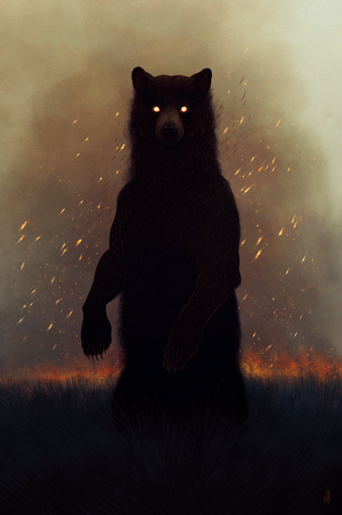
Dappermouth
An artist who visually expresses what I immediately saw upon my first impression of the word and connotations of Eerie, was an artist named Jenna Barton (Alias: Dappermouth). A modern artist, she is an artist that creates beautiful digital renditions in Photoshop, depicted twisted and almost ghostly renditions of animals.
“They’re waiting beyond the trees.”
Most of her work depicts a lonely figure, its focus upon the viewer, as if it’s staring out from beneath the piece itself. There is a cryptic, monstrous quality about her work, however also a sense of gentle melancholy in the certain isolation.
“Another world gazes through grease and smoke.”
Her work pertains to a simple colour palette; usually muted blues, blacks, browns and sometimes undertones of green, however the pieces are usually offset with warm auburn, reds and oranges. These stark juxtaposing tones create a vivid clarity about the pieces; a boldness in their darkness; like pale stars against an inky black sky. There is something so enchanting about her use of colour that I’ve simply fallen in love with.

“Ground turning dark, growing cold.”
This piece depicting a black goat (Black Phillip) – in particular – triggered a memory of the movie, the VVitch. It is true, the pieces do hold a certain peaceful sadness around them, however that may also be interpreted as ‘eerie threat’. Like demonic entities not from this world. There is a certain use within the media of these types of animals; like comparing an animal to that of a witch’s familiar, or gateways to hell and the underworld. There are obvious religious overtones with that perception, especially with the superstition of witches in the early centuries.
21/11/2018
I’ve been doing some visual testing over the past few days; working with my interpretation of the word Eerie and creating visual elements pertaining to connotations of it in my mind. This has been done in pages of my sketchbook.

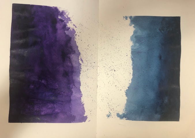
I began with associating the word with colourations and’texture’ of colour. So, for example, whether it’s a block solid or more fluid such as watercolour. I decided that cool tones such as blue or dark purple are the most suitable, due to their brisk and melancholic tonal associations. I didn’t want to only limit myself however and implemented some white among it.

These are more thumbnail testings, trying out tones and implementing different colours to different desired effects. The blending of one colour into another, the isolation of the white, the swirling nebula-like image of the blue and pink; they all culminate together, united but different.

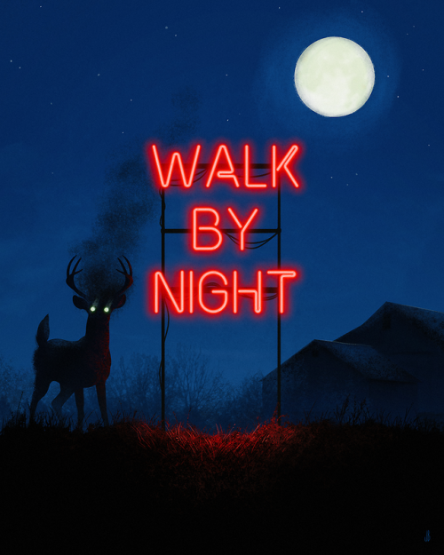
Inspired by Dappermouth, I’ve become insistently inspired by the symbolism of animals; whether that be of darker descent (in terms of associations with the devil or death) or merely as a witch’s familiar in general. Going back to the theme of the VVitch, in particular. I began to think of other circumstances where animals were used in a menacing way, or used in accordance to some particular meaning.
An instance of this would be of NBC’s cancelled show, Hannibal. A show exploring the psychology of Hannibal Lecter and Will Graham. A consistent plaguing feature of the series is initially an immense nightmarish stag, before metamorphosing into a Wendigo in the guise of Hannibal himself.
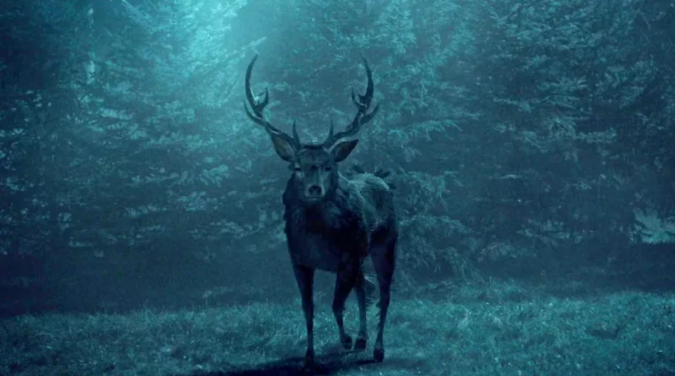
In both instances of colour, this image depicts the eerie quality that Dappermouth’s work reciprocates. The muted, consistent tones of blue; the front profile of the deer being that of rather disconcerting. The associations with deer as being primarily peaceful, elegant animals shine through here but also due to the colour, it melancholics the entirety of the scene; creating a cold, perhaps even menacing depiction of such a beautiful creature.

More experiments; acrylic on paper. It gained this lovely shiny and smooth texture; perhaps due to an excessive amount of layers of paint, however it dried quickly and I found myself liking it. Contrasting the whites with the cool tones of the blues and purples. I’m thinking about a few routes I can pursue. I’d like to create silhouetted stencils of animals, painting them out like in the method above and creating a collection of almost ‘space’ or ‘nebulae’ entities. This almost deifies the animals and surges their immediate importance.
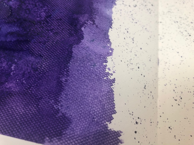
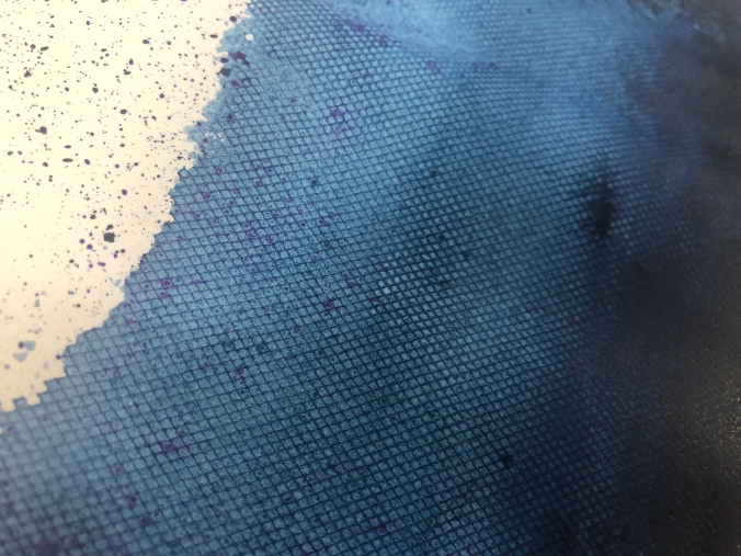
Now this small piece in my sketchbook began as an experiment by placing a mesh material over the paper and painting over it. It was simply meant as a way of me seeing if it actually would change the piece in any way, as opposed to just blotting out the paint. It ended up giving it a lovely textured surface! That, coupled with what visually could be interpreted as a ‘pixelated’ edge due to the mesh being particularly porous and allowing the paint to take the shape of the holes.
Another idea I had for experimentation was creating a book, implementing the word ‘eerie’ into an almost narrative series of pages, combining prints or paintings like the style above, or even divulging more into the ink printing side, such as mono-printing…
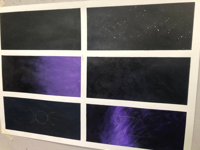
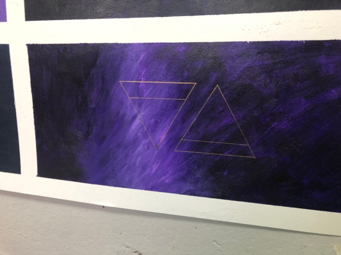
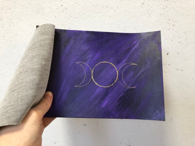
Looking at aspects of Witchcraft, I decided to look at particular symbols associated with Wicca history, of which was a Pagan religion believing in witchcraft. Some of the symbols have been ingrained into our society even today, such as gender symbols and the elemental signs.

I made a small page on some of the symbols that interested; combining a mixture of the bold black with gold; which created a stark contrast between the colours, of which was very appealing. I decided to implement that into my possible final pieces.
30/11/2018
Over the course of the last week I ended up deciding to follow the book route, following a piece of thumbnail images which could be construed as being book pages, I realised;

I ended up deciding to add the gold embellishments however in the form of the Wiccan symbols! If I had more time I would have implemented more of an animal element into the pieces, however due to a lack of time, I decided ultimately to stay within my own reaches so I didn’t make too much, without finishing any of it!
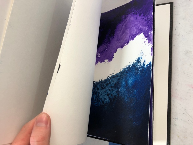
The pieces’ colours are a mixture of deep purple, blue, black and white as toning, so it maintains that deep and eerie gloominess to the tone however doesn’t get caught up in being too complicated. The first book I made ended up starting as some thumbnail images, before I decided to add a cover and bolt them all together:
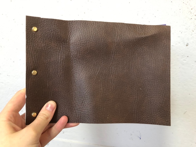
This, I believe, WAS successful however I also wanted to explore more options with binding and hardback covers. For another part of my final piece, I ended up being given a hardback book that had a phrase imprinted on that intrigued me.


I ended up painting over the cover, so that the only gold peeking through depicts the word ‘eerie’. I thought this was a funny play and alternate approach to the conventional book cover. The use of the solid black too also plays into my themed word of eerie. The subtlety of the rest of the phrase hidden beneath, coupled by the haunting faces that catch the light, I think it was a good use of an existing source.
I really liked the outcome of the final piece, however I wish I had more opportunity to explore the other elements of the witchcraft theme and the elements of animals and demonic creatures. But, all the same, the outcome has possibilities to go further and one day would definitely like to return to this theme as it is something that deeply fascinates me…
Cut and Paste
30/10/2018
The beginning of this project was birthed with the idea that other artists were likely your greatest ally upon the first introduction into the theme of ‘Cut and Paste’. I won’t deny the term itself brings forth a great unease from my Nursery days, playing with craft scissors and getting covered in glue. I didn’t like getting dirty as a child, and I wasn’t particularly gifted with scissors either (curse being left handed). I’m a person greatly integrated into both traditional-styles of drawing and digital media, almost bypassing collage entirely in my youth. Despite this, I never completely disregarded it and always awed at those with particular gifts or a natural ability. A deep rooted respect for something I’ve never been able to achieve, simply because the idea of it terrified me; lacked control; was far too open. Which are hilariously pathetic reasons but a fault of mine is that I’m a creature of habit and new things scare me. This is why I’m at art school. This is why I’m always terrified nowadays.
So, with that advice, I began scouring resources for some artists that peaked my interest. One of which was first introduced to us in our lecture hall.
John Stezaker
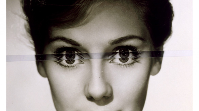
Stezaker, an English conceptual artist, was the first which lit up my eyes in a way that was endearing. From first interpretation, I expected his pieces to be based around the theme of identity; with the cross-implementing of usually two faces, slit down the centre and combined delicately to make some new profile.
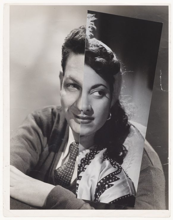
There is a quietly disconcerting melancholy surrounding his work; though most the original recipients are smiling, it seems vacant and hugely hollow. From appearance they seem to be home images you would take at school, or even the headshots that actors take when applying for roles and sending their face out. From further research I discovered this wasn’t too far from my analysis. “Collectors of cinema memorabilia have a name for anonymous actors who were photographed for publicity stills, but never actually made a film. They call them ‘virgins’. When I go to collectors’ fairs, it’s the virgins I’m after.” – John Stezaker
In a way the work can be interpreted that Stezaker is a form of Frankenstein, stitching together elements of faced (or scenery shots) and creating something inherently human but not quite right. With the knowledge that these are failed actors, it’s almost as if he is speaking about Hollywood and the fierce competition; which is both a comment on today and back when these images were taken. Faces blend together; perfection is sought out and never achieved and these failed actors are thrown away, only to be found by Stezaker at collector’s fairs.
I’m a person very interested in media; the movie industry having an especially prominent place in my life. As source of joy and disassociation, it’s strange to think of these fantasy worlds having so much political agenda behind them. So much hierarchy; drama; toxicity and corruption. In an effort to be authentically fake, the movie industry becomes all too real. With scandals such as Harvey Weinstein and Kevin Spacey, by default this will affect our interpretations of such media proceeding forward.
Nicole Moss
I decided I wanted to branch out from the given artists and explore the Canadian artist, Nicole Moss; someone who I had heard of in passing and decided to do a little research about. Differing from Stezaker, her work depicts a lot more colour and vibrancy; with far less subtlety in her work.
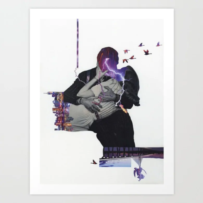
Moss’ work is drawn from a sleep disorder she has unfortunately been diagnosed with; Non-rapid eye movement parasomnia. This heightens the subjects within her dreams (able to refer and recall them in intimate detail) and allows her to sleep walk more than the average person might. Her work depicts pseudorealistic depictions of relationships, family dynamics, feminism and Western cultural precepts.
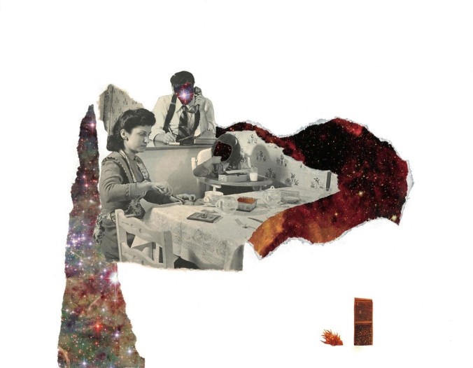
Dinner Time: “The mother attends to the needs of her daughter, while the husband attends to matters of far off importance—his face engulfed by a great celestial light, illuminating worlds so distant from his own. The mother obediently accepts the household work, her back turned on the galaxies and star clouds that exist so far from her own perception, so foreign to the cloth and woodwork of her simple home. A single door resides at the bottom of the frame, so distant from the star-scapes and the bleak domestic setting, this escape never dismissed from the mind of the woman who ever holds it in her outer vision.”
Her work is highly symbolic and seems to depict emotions through emotive imagery; using the interpretation of lightning for a kiss, implying the rush or feeling of elation of being in love; the use of nebulae and galaxies in her work Dinner Time, as though the woman depicted cannot ‘see’ further than her motherly duties, like the rest of her family can, as their faces are masked by these galaxies. That the outside world is foreign, distant and alien to the woman; whether due to the patriarchy (as the work is depicted using vintage media) or by her own accord.
I enjoy the idea of combining a political message with film, or media, in a way. I’ve had a few flittering ideas today as I’ve been working; such as recreating movie scenes with a suggestive political message behind them; either adding political figures in their place, or enunciate the quotes or text used within the film, highlighting any problematic themes that may have arisen, or that I see fit.
Around mid-afternoon today I went out to a scrap store that resell any items people don’t want for a very nice, discounted price. I picked up four old VHS tapes, one of which in particular caught my eyes prominently. It was a copy of L.A Confidential, starring Kevin Spacey. I immediately laughed out loud at the irony of having previously written about him in passing, then immediately found a tape of him, in very good condition. My mind began to tick.
31/10/2018
Today I began my experimenting with a few things I had collected. I took one of the flyers I’d picked up and began to cut everything out on the front image. Then, taking one of the VHS tapes I painted it blue to match the original background of the image. Originally, I hadn’t sanded it down; which was evidently a mistake as it all peeled and crusted off the smooth surface. So I repeated it after having sanded it and this seems to have taken a lot better than before, giving some of the paint some texture to cling on to instead of the very smooth plastic. I then stuck the graphic image to the VHS and the result turned out quite nicely.

With this, I’m experimenting with routes that I can go down. I enjoy the implementing of movie scenes onto different elements, so this might be an interesting option to go down. That, or I’ll pertain that theme more with the alteration of scenes as opposed to simply ‘implementing’ the literal perception of ‘cut and paste’. My lecturer informed us that ‘if you look at a piece and it doesn’t make sense, it’s not good’. This was a bit unnerving, as a lot of the work around the studio was very, very aesthetically pleasing however didn’t convey a particular message.
2/11/2018
I realised that I needed to start trying to find a focus for my project; that experimenting with ideas wasn’t enough (and was a very Fine Art approach). Thus, my eyes turned to the digital world and using things like Photoshop and Adobe After Effects to start trying to convey messages in my work. I had a discussion with my lecturer and he informed me that the general theme of ‘Film and controversy’ was a far too big subject matter and condensing it further was going to – not only be more effective – but actually easier for me upon looking at the second week.
Before talking with him I did some experimental After Effects work combining famous movie scenes with a controversial figure, coupling it with text which is both emotive and subtly ties in with their respective individual issues.
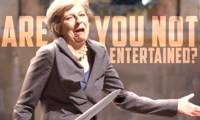
Shown is my edited version of the original screen-grab from the movie, Gladiator; Depicting Theresa May with a sword, with the original movie quote superimposed behind her.
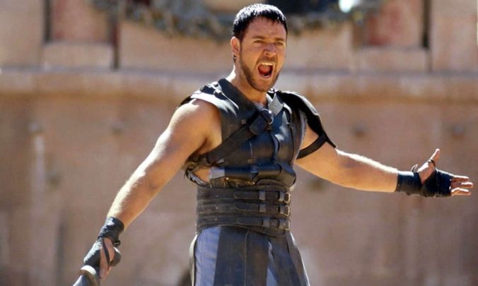
This is the unedited, original scene from the movie Gladiator, depicting Russel Crowe as General Maximus.
This piece depicts Theresa May in Crowe’s place, however juxtaposing the valiant and courageous character of Maximus, through Theresa’s face the viewer is conveyed a comedic sense of childishness. She is holding a sword however it feels misplaced; the weapon itself symbolising authority and power. The term ‘Are you not entertained?’ feeling more like a petty quip as opposed to a resounding statement from a hero. The phrase itself is a comment on the ‘game’ may seems to be playing with the general public; as if the whole ordeal with Brexit (for example) is a theatrical, dramatised production. If someone wanted to look deeper, the use of a sword itself is innately masculine, as there is deep-rooted phallic connotations with the object. Though not a comment on gender, the weapon is misplaced in her hands; suggesting her misplacement in her own role. The lighting I tried to emulate with the high contrasts and harsh light source from the top left corner of the image…
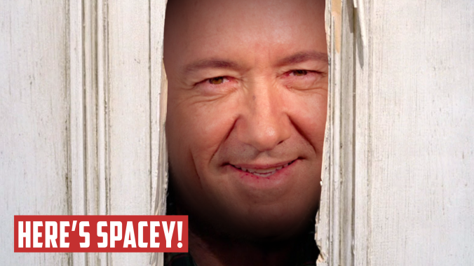
Depicted is my edited version of a scene from ‘The Shining’; conveying Kevin Spacey as a version of Jack Nicholson’s character, Jack Torrance. An altered version of the original quote has been added also.
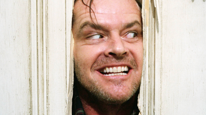
This is the original, unedited scene from the movie, ‘The Shining’.
This piece might be slightly more unequivocal in terms of its subject matter. Kevin Spacey is depicted as a psychotic ‘mad-man’, Jack Torrance in a very predatorial manner. The scene itself proceeds the moment where Jack breaks through the door in order to kill his wife. Though very much hyperbole in terms of what Spacey has done (he – as we’re aware – hasn’t killed anyone as of yet) it accurately depicts the monstrous character that he is, and perhaps the isolation of his victims, similar to the character’s wife’s isolation in the setting of the movie. The use of the text adds a punchy, almost comical addition to the piece, almost lightening the mood of the piece. These pieces are supposed to be taken with a grain of salt. It is not diminishing the emotional impact someone like Spacey has had on the world, but is trying to be more approachable to those that might not understand the perception on Spacey.
5/11/2018
Upon further consideration, I decided that I wanted to focus on the #metoo movement; or more specifically, those accused of sexual assault in Hollywood which triggered the movement itself. Controversial figures all being at a focus of this project. I am going to experiment with symbolic pieces of work; perhaps a sequence which provides a narrative of thought. That, and I will continue my movie scene work as that ties in with the ideology that those that create the art, ultimately are apart of it; or that it reflects them as a person.
I decided to start off my doing a piece a little more ‘on-the-nose’ but still held the connotations of production and the theatrical elements; almost a parody of itself. This piece I named, PIGS! The movie:
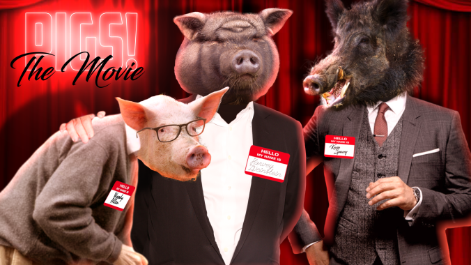
The stars of this wonderful production? Woody Allen, Harvey Weinstein and Kevin Spacey; all in their respective ‘pig masks’. In all seriousness, the symbolism of this is a parody of parody movies; with outlandish and silly titles with a strewn of people cast that are often desecrated for starring in such a production. The purpose of the pig heads are purely symbolic. The connotations of a pig being a smelly, unpleasant animal which thrive on farms, wallowing in their own filth and reveling it. The other side of this is that pigs are incredibly intelligent animals; often underestimated for their repugnant stereotype. To be able to thrive in the public eye for so long, these men can either be regarded an immensely intelligent for covering themselves up for – in some cases – decades at a time, or so juvenile and idiotic that they never believed they would be caught in their terrible acts. Also, more crudely, referring to someone as a pig refers to their disgusting attitudes, fat tendencies and generally a sense of dislike. There aren’t many positive connotations in referring to someone as a pig. The use of the red curtain behind the figures depicts the ‘theatrical’ element to the piece; as though once again it’s a large performance, or even pantomime. The point is to exaggerate their roles as influential figures in order to degrade their image.
In Lord of the Flies, a pig head symbolises the progression of horror and violence. In Animal Farm, the pigs depict an abuse of power and hierarchy.
07/11/2018
Today and yesterday I’ve been spending the day making a series of images which can be presented pretty well together in a collective series. The idea acts as a twisted version of the Oscars, with celebrities that have been convicted and accused of abuse being depicted in these ‘mock-up’ awards where the prizes are humourously derogatory and parodies of the real thing.
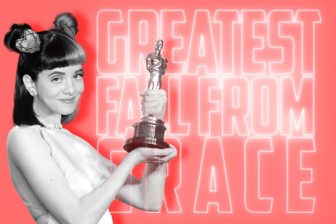
‘Greatest Fall From Grace’ – depicted by Melanie Martinez

World’s Biggest Paedophiles – depicted by Woody Allen and Jimmy Savile
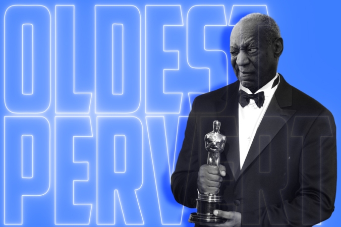
Oldest Pervert – Depicted by Bill Cosby
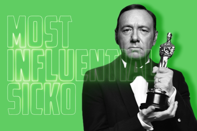
Most Influential Sicko – Depicted by Kevin Spacey
I had to edit all of their heads on to differing bodies so that they consistently held the Oscar award in full view. Even Oscar-winner Kevin Spacey had to be edited as there was not an image of him which suited the edit, of high quality. Martinez’s edit was the hardest to achieve as I had to find a dress suitable to her style, whilst also matching her skin tone. Colours weren’t an issue as I inevitably grey-scaled all the actors, whilst giving them a more vibrant background.
The actors, influencers and celebrities hold their awards in pride; with their personas of great likeliness and humour. Depicting that once they were admirable people, perhaps role models for some. But what a label, accusation or conviction can do to one’s personal image or other people’s perception of them can have a rippling effect. I didn’t want to demonise men exclusively despite the inherent percentage of those accused in the #metoo movement being male. I also wanted to make a comment on the capabilities of women in the media also, which is a reason why I included Melanie Martinez in my ‘line-up’ of celebrities.
I ask you: what do any of these people have in common with each other? Regardless of race, gender, height, sexuality, age and body-type, it is clear anyone is capable of abusing their authority; abusing their power and taking advantage of those in either vulnerable states, or those who fear for their careers. These people are only a small fraction of those accused of sexual assault and abuse, and it is likely there are countless more that are yet to be exposed. Hollywood, it seems is a toxic environment, where the heirarchy is exploited beyond measure, and power can sway even the harshest of critics. It is now positive that movements such at #metoo and TimesUp are flushing out the offenders like fresh game, hopefully to be shot down in their state of ruthlessness. Only time may tell what will happen in the future.
What is Sculpture?
10/10/2018
The small saplings of this project began with me considering the possibilities of a typical sculpture; you know, the clichè of moulding clay or some other pliable material in which I could present at the end of the two weeks and go ‘ta-daaa, look how wonderful this is’. Well, that was my first impressions of the title, anyway. Upon further inspection, and guidance, I came to realise that this was art school, and such thoughts need to go to the ground to die. Yes, I knew a moulded piece of clay could possibly become the outcome of my project, however I forgot the most important aspect of my initial thought process; reassess everything I know and challenge it. To truly define the meaning of sculpture. From our presentations, I came to realise it was not the outcome in which was important, but the thoughts and processes behind it. The evidence.
Now what is sculpture? This I pondered over for a few days; not really wanting to commit. But upon contemplation, I registered, whilst staring at a blank page, that I was looking at the very thing I needed to break myself away from. Paper; sketchbooks; evidence. Evidence.
11/10/2018
I see sketchbooks in the vain of fingerprints in the sense that they are unique to an individual. No one thinks the way you think, and thus their originality is something deeply personal to every artist. But they start off as so blank and impersonal; something you have to mould yourself. Considering that, I found that perception of them to be cold and disconnected. Personally I find blank sketchbooks to be intimidating and I am never able to fill them to the extent that I like, wanting to create a thing of perfection as opposed to an object of development, assessment and learning, which is really what I think they should be used for.

Example of an unfinished piece in one of my sketchbooks
Today, I ultimately decided I wanted to begin by making books. I had practiced during my time at Secondary School a few methods of binding paper, so I decided to experiment. With a thick needle and thread I performed a Japanese-style stitch on some spare paper, creating a small, seemingly inconsequential booklet of which I flipped through and played with. I liked it. The feeling of personally bringing it together felt far more personal. The thread was silver; it was pretty. I held a certain power over what I wanted personally in that little book.

Japanese stitch on sheets of paper; created by punching holes and binding with silver thread.
Thinking of this, though, I realise what I was doing was only reciprocating what professional bookmakers were doing: combining ordinary sheets of paper. Though I had control there was still a deep sense of an impersonal disconnection from the actual object itself. Yes, I had made it but it felt very mundane; very reserved in what I could possibly be able to do. I had considered making my own paper previously but dismissed it due to the assumption it would be too hard. But, considering it further, I decided to look up some tutorials to see if it was achievable in the two weeks we were provided with.
I then resolved to watching a very grainy, poor-quality video of an older gentleman describing how to make paper. The endearing-quality to his enthusiasm gripped me almost immediately and I became enraptured with the method of making and the different combinations possible in creating paper. I could alternate colour through inks; change texture and thickness and create different sizes. My mind inevitably wandered and I began thinking of all the other things I could add to the paper – those which were perhaps a little more experimental and could be interpreted as alternative. This included adding natural plant dyes; plants themselves (such as flowers or leaves); glitter; paint; perhaps even things like hair or food. I was enriched with possibilities. Though the process initially seemed to be fundamentally tedious (as creating paper from paper seemed counter-intuitive in all aspects), I realised it was the core processes used in making the paper. With a few scraps of spare paper I could make something rather beautiful. It’s alien territory and the idea of it is troubling, but I’m prepared to experiment and see where it leads me.
I ended up deciding I wanted to make a deckle myself and not resolve to buying any online kits which were available. Firstly, I bought two canvases with the sole purpose of removing the material to extract the frames beneath. This was a cheaper alternative to buying a picture frame or less time consuming than having the two frames made.
Above shows a time lapse of the removal of the canvas from the frames; extracting each staple and ripping out the binding. This was fun. I then had two frames left behind to provide the base of my deckle.
12/10/2018
Now the hard part was finding a suitable mesh for the paper to be created on as the material had to be porous like a softer material but stiff enough to withstand water, such as metal. I attempted to use a soft, costume-style mesh which simply was not suitable initially as it was too thin and likely would not withstand multiple uses; its durability questionable. The latter option was obviously to use metal so I ended up trying a slim aluminium mesh which was soft enough to bend and shape and cut but hard enough to extend its durability and lifespan as it would not rip easily and the likelihood of degradation was far in the future. I wanted to use this over an extended period of time and thus its reliability was important.


The mesh was stabled and duct-taped to prevent any unwanted tears of the skin, as the metal was particularly sharp.
Something I considered doing whilst making the deckle was creating what essentially could be ‘artist books’; a meta way of providing evidence via the use of what could become a final piece. A collection of books, but what could they contain? I began to think of the subject of impersonal and personal aspects; the contrasts and methods to use. If I made a book about myself, I could literally place a piece of myself within it.
16/10/2018
My first collection of paper was created by filling up a basin with water a quarter of the way full (though I later discovered that filling it up further would actually aid me and not reduce the quantity of product filling up the deckle).


I ripped up a small amount of thick paper, which had a subtle yellowish tone. I decided that I wanted to experiment with a thicker consistency immediately so it didn’t fall apart so easily when putting the paper together and pulling it off the grid. This shredded paper was then popped in a blender (along with more water) and blended into a watery, mushy pulp. This was dumped into the basin and it dispersed until the water was opaque. I repeated the process a few times before the water was entirely cloudy and running a hand through it I’d feel some of the particles of pulp throughout it and a slightly thicker consistency than usual. Putting my frame together – with kitchen roll and an array of towels to my dispense – I pulled the frame through the basin of pulpy water… and I inevitably held my breath and doubted the whole process of making the deckle, obviously – before pulling it up and out. And it had worked!! The material clung to the thick mesh, the porous spaces allowing the rest of the water to trickle through. It didn’t seem like much at first, being clumpy and uneven, but I knew it worked and that’s all that mattered in the moment.
I replaced the material back in the water and took better care in pulling the frame through and evening it out when it broke the surface again. I removed the mould of the frame and placed the underneath section (that still contained the pulp) on a towel and squeezed all the remaining water out by blotting it and pressing it with a car washing cloth. This soaked up a large amount of the excess and made it easier to peel off. Now, despite this, peeling it off proved to be rather difficult, a few attempts later proving that using the thicker paper until I got the hang of it was likely a sensible option. 
The result reminded me a lot of what watercolour paper looks like; almost taking on the appearance of cotton. They also seemed to lose their yellowish quality, muting them to a more very pale lemon, or off-white beige. Drying it became an issue, as I had to put sheets of kitchen roll on each individual piece of paper and place heavy weights down on them for an extended period of time. As I was at home when I was doing this, and had to return to University the next day, I had to take measures to ensure they were dry whilst transporting them. I’d heard that ironing them was a method I could use to reduce the time and also flatten out any unwanted bumps along the way, which is what I ended up doing. Since they are now dry, there is a rugged, imperfect quality about the pages which could only be achieved as they are handmade, which I really like. Some of the texture was picked up from the kitchen roll and is pressed into the material, others are slightly torn or ragged around the edges from a slight lack of pulp in one area, or crudeness in removing them from the deckle. I don’t see this as an issue if I’m honest.
22/10/2018
I decided to put together my first official collection of paper by the same method that I tested out on the scrap paper; the subtle and rather easy Japanese stitch. I used a stark black thread that contrasted the pale and washed out colour of the paper to give it a more striking appearance.
This time-lapse depicts the process in which I used to create the little book; by clamping it down with a couple bulldog clips so I ensured that no matter how much I moved the piece around, the paper wouldn’t slip and adjust, with scrap paper underneath so the clips didn’t create indents. So it basically made my life a lot easier.
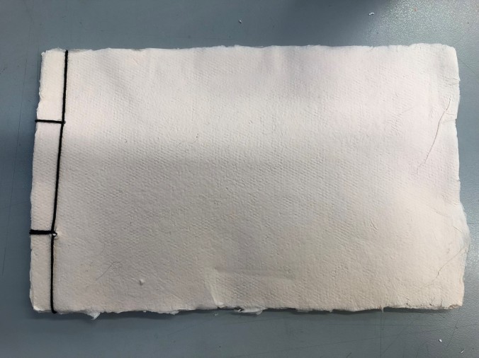
Here is the end result in all its rough glory. Some of the edges of the paper (as you can see) are ragged and untrimmed, definitely giving it a hand-made, authentic feel. The downside to this is that it could be seen as unfinished or lazy, its ‘roughness’ a direct comment on the work possibly. But personally I like the ruggedness of it and making it trimmed and picture perfect juxtaposes the initial message and aim I had for the project; making what is initially impersonal, personal and real. A perfect image would seem like it was produced in a factory, whereas it is clear that this was made by a real person, by real hands that spent a lot of time on it.
25/10/2018
I ended up making a lot of paper, all of which is still drying as I write this. As I don’t have enough time to thoroughly complete what I aimed to achieve, I am going to write a plan for the future, so I can return to the project over time and add things as I go on.
- Make a large selection of books and paper, all pertaining to differing themes visually. For example, following a colour palette; adding the plants or organic objects to see if they hold; add colours or glitter, or other features to make them original.
- Begin to draw in them. This, I think, could act as either travel journal, a diary (to relate back to theme of the impersonal comparing to the personal aspects of drawing or writing), or small sketches. This will complete an artist’s set of books, of which can be returned to and interacted with on a larger scale.
My project is only at the stage of being a sapling; it has more potential and definitely more room to grow.
