16/11/2018
Letter given: E
Word Chosen: Eerie
Personal colour and imagery associations: Dark; muddy; gloomy; vacant space; silence; contrasting; cold; melancholy; purples; omniscient; hellish; A Quiet Place; tension; blue, or navy; The VVitch; ghostly; shredded; singular entities; monstrous; nature; natural; demons; possessed; archaic; religion
This project began with the initial providing of a singular letter, individual to each person. We had to decide, with this letter, a single particular word which triggered a visual, emotional or response which could provide the image of colour. I was given E as my letter, before pondering over words and coming to the conclusion that Eerie was emotive enough for myself. Though I don’t explore it a lot, I enjoy the darker depictions in art; with perhaps sinister imagery or meanings. The term eerie was rather open with interpretation, though in literature I was often reminded of all the horror novels I had read; the tension between each word and the author’s craft in holding me by my throat every time I flicked through the pages. My immediate colour associations was of muted blues; frigidity and almost cold vacancy. My mind explored and then I imagined the contrasts between colours; how a single tone could be immediately singled out and ‘trapped’ between others.
Dappermouth
An artist who visually expresses what I immediately saw upon my first impression of the word and connotations of Eerie, was an artist named Jenna Barton (Alias: Dappermouth). A modern artist, she is an artist that creates beautiful digital renditions in Photoshop, depicted twisted and almost ghostly renditions of animals.
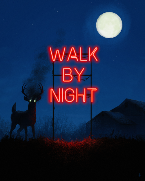
“They’re waiting beyond the trees.”
Most of her work depicts a lonely figure, its focus upon the viewer, as if it’s staring out from beneath the piece itself. There is a cryptic, monstrous quality about her work, however also a sense of gentle melancholy in the certain isolation.
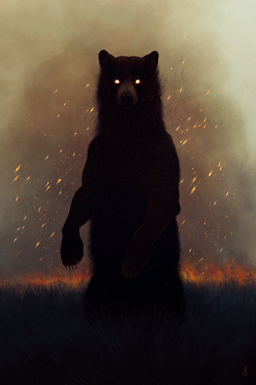
“Another world gazes through grease and smoke.”
Her work pertains to a simple colour palette; usually muted blues, blacks, browns and sometimes undertones of green, however the pieces are usually offset with warm auburn, reds and oranges. These stark juxtaposing tones create a vivid clarity about the pieces; a boldness in their darkness; like pale stars against an inky black sky. There is something so enchanting about her use of colour that I’ve simply fallen in love with.

“Ground turning dark, growing cold.”
This piece depicting a black goat (Black Phillip) – in particular – triggered a memory of the movie, the VVitch. It is true, the pieces do hold a certain peaceful sadness around them, however that may also be interpreted as ‘eerie threat’. Like demonic entities not from this world. There is a certain use within the media of these types of animals; like comparing an animal to that of a witch’s familiar, or gateways to hell and the underworld. There are obvious religious overtones with that perception, especially with the superstition of witches in the early centuries.
21/11/2018
I’ve been doing some visual testing over the past few days; working with my interpretation of the word Eerie and creating visual elements pertaining to connotations of it in my mind. This has been done in pages of my sketchbook.

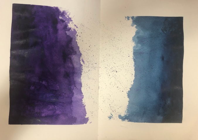
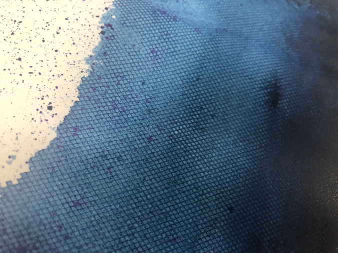
I began with associating the word with colourations and’texture’ of colour. So, for example, whether it’s a block solid or more fluid such as watercolour. I decided that cool tones such as blue or dark purple are the most suitable, due to their brisk and melancholic tonal associations. I didn’t want to only limit myself however and implemented some white among it.

These are more thumbnail testings, trying out tones and implementing different colours to different desired effects. The blending of one colour into another, the isolation of the white, the swirling nebula-like image of the blue and pink; they all culminate together, united but different.

Inspired by Dappermouth, I’ve become insistently inspired by the symbolism of animals; whether that be of darker descent (in terms of associations with the devil or death) or merely as a witch’s familiar in general. Going back to the theme of the VVitch, in particular. I began to think of other circumstances where animals were used in a menacing way, or used in accordance to some particular meaning.
An instance of this would be of NBC’s cancelled show, Hannibal. A show exploring the psychology of Hannibal Lecter and Will Graham. A consistent plaguing feature of the series is initially an immense nightmarish stag, before metamorphosing into a Wendigo in the guise of Hannibal himself.
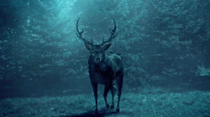
In both instances of colour, this image depicts the eerie quality that Dappermouth’s work reciprocates. The muted, consistent tones of blue; the front profile of the deer being that of rather disconcerting. The associations with deer as being primarily peaceful, elegant animals shine through here but also due to the colour, it melancholics the entirety of the scene; creating a cold, perhaps even menacing depiction of such a beautiful creature.

More experiments; acrylic on paper. It gained this lovely shiny and smooth texture; perhaps due to an excessive amount of layers of paint, however it dried quickly and I found myself liking it. Contrasting the whites with the cool tones of the blues and purples. I’m thinking about a few routes I can pursue. I’d like to create silhouetted stencils of animals, painting them out like in the method above and creating a collection of almost ‘space’ or ‘nebulae’ entities. This almost deifies the animals and surges their immediate importance.
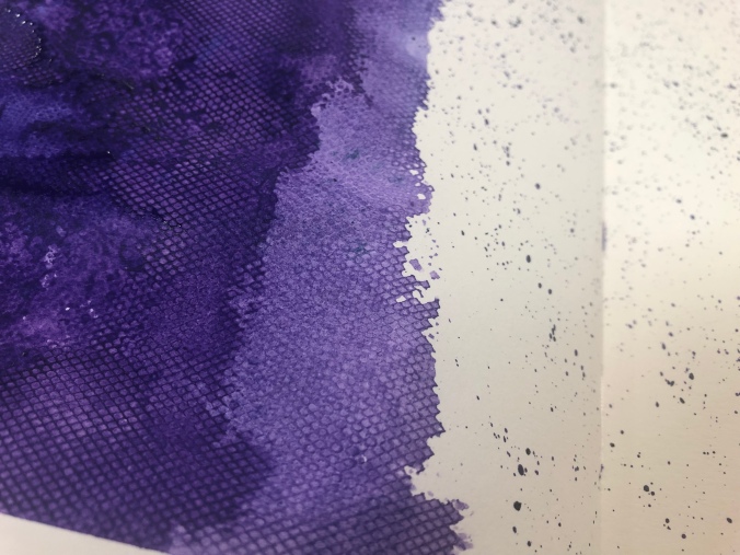
Now this small piece in my sketchbook began as an experiment by placing a mesh material over the paper and painting over it. It was simply meant as a way of me seeing if it actually would change the piece in any way, as opposed to just blotting out the paint. It ended up giving it a lovely textured surface! That, coupled with what visually could be interpreted as a ‘pixelated’ edge due to the mesh being particularly porous and allowing the paint to take the shape of the holes.
Another idea I had for experimentation was creating a book, implementing the word ‘eerie’ into an almost narrative series of pages, combining prints or paintings like the style above, or even divulging more into the ink printing side, such as mono-printing…
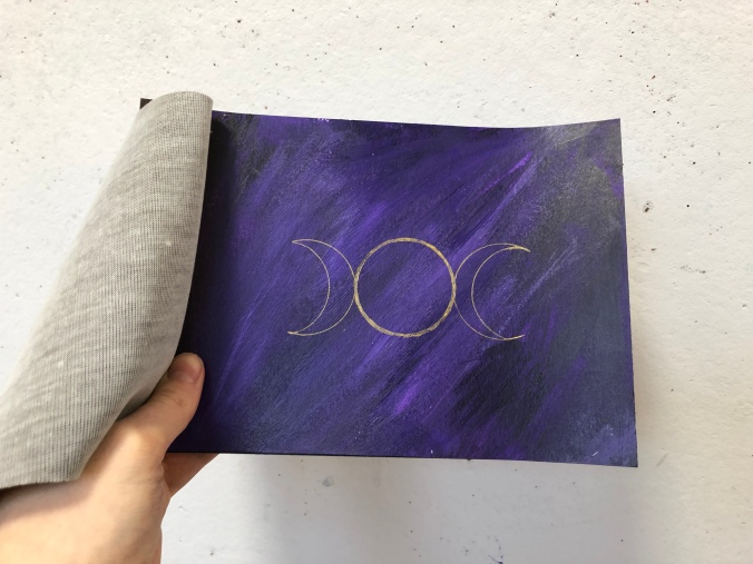
Looking at aspects of Witchcraft, I decided to look at particular symbols associated with Wicca history, of which was a Pagan religion believing in witchcraft. Some of the symbols have been ingrained into our society even today, such as gender symbols and the elemental signs.

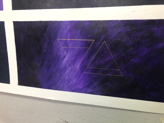
I made a small page on some of the symbols that interested; combining a mixture of the bold black with gold; which created a stark contrast between the colours, of which was very appealing. I decided to implement that into my possible final pieces.
30/11/2018
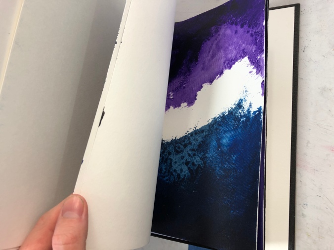
Over the course of the last week I ended up deciding to follow the book route, following a piece of thumbnail images which could be construed as being book pages, I realised;
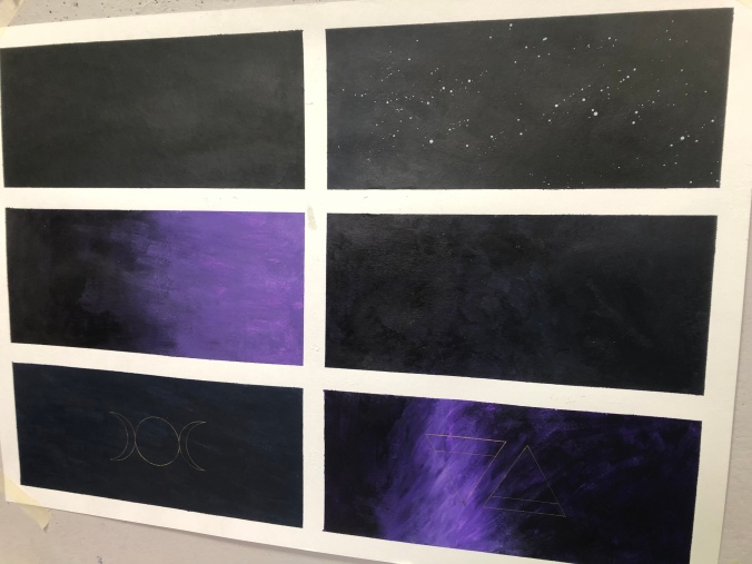

I ended up deciding to add the gold embellishments however in the form of the Wiccan symbols! If I had more time I would have implemented more of an animal element into the pieces, however due to a lack of time, I decided ultimately to stay within my own reaches so I didn’t make too much, without finishing any of it!
The pieces’ colours are a mixture of deep purple, blue, black and white as toning, so it maintains that deep and eerie gloominess to the tone however doesn’t get caught up in being too complicated. The first book I made ended up starting as some thumbnail images, before I decided to add a cover and bolt them all together:
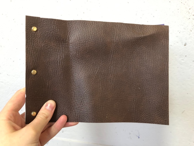
This, I believe, WAS successful however I also wanted to explore more options with binding and hardback covers. For another part of my final piece, I ended up being given a hardback book that had a phrase imprinted on that intrigued me.


I ended up painting over the cover, so that the only gold peeking through depicts the word ‘eerie’. I thought this was a funny play and alternate approach to the conventional book cover. The use of the solid black too also plays into my themed word of eerie. The subtlety of the rest of the phrase hidden beneath, coupled by the haunting faces that catch the light, I think it was a good use of an existing source.
I really liked the outcome of the final piece, however I wish I had more opportunity to explore the other elements of the witchcraft theme and the elements of animals and demonic creatures. But, all the same, the outcome has possibilities to go further and one day would definitely like to return to this theme as it is something that deeply fascinates me…
